

The confidential information in this case study has been altered
Background

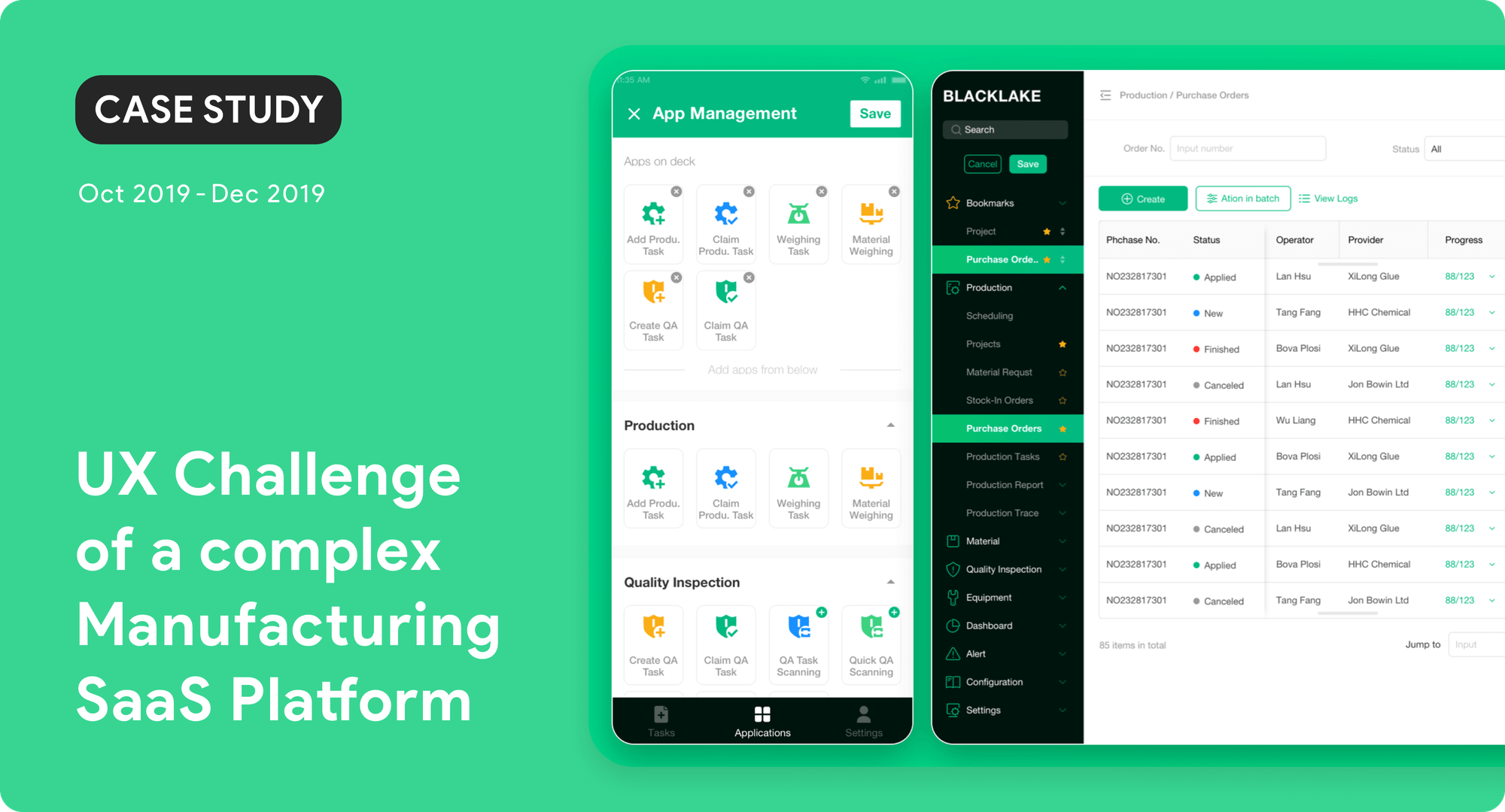
A SaaS with 6 main modules on the desktop for planning and 100+ features on mobile for executing, that creates synergy in the manufacturing industry
This platform belongs to a rapidly-growing company with employees growing from 10 to 200 people during 2017 - 2020 in Shanghai. The major service is a SaaS platform that streamlines the production flow and creates synergy in the manufacturing factory.
It allows the different roles to operate on desktops, tablets, and mobile phones. As the business significantly expanded, the strategy that leaned on the features building revealed more and more unfriendly experience throughout the platform.
Role
My role was to lead the UX Improvement and facilitate communication between 6 product managers, 12 customer successes, 15 developers. My responsibility was across user research, experience design, project management and partially visual design, including:
1. Analyzed and organized the requirements, and defined the problems 2. Conducted on-site research and user interview to verify the use cases 3. Created user flow and wireframe to communicate with stakeholders. 4. Wrote the PRD and evaluated the solution with CS and developers. 5. Created an Axure PR interactive prototype for user testing. 6. Set up the road map and phases for the developers. 7. Collaborated with a UI designer to create the high-fidelity mockups. 8. Reviewed UI acceptance before launching the improvement. 9. Followed up on the result and collected feedback from our clients.
Challenge
“ My job is to finish the production, not to figure out how to use your platform.” — Frontline Users “

The complex information architecture and navigation system on the platform led to negative feedback from the end-users
In manufacturing, the production flow could be varied and diverse from different products, and the factories may reset the workflow based on different orders every time.
Therefore, the flexibility of this platform was always an advantage, until the voice of “This is too complex!!” was getting louder and louder.
My goal was aiming for helping all roles in the factories to locate and operate the required features efficiently and smoothly, and make flexibility become an advantage again.
The high-level goals 1. Let the different roles adapted into different workflow painlessly 2. Refined the massive information by the contexts that the users required 3. Laid the groundwork of a user-friendly platform for the future iterations
Requirement

150 raw requirements of user experience aggregated from pieces to clusters.
Since 2019, the CEO has received more and more feedback about “unpleasant experiences” toward this platform, therefore, the customer success team (CS) and I launched a survey across our clients’ factories, deciding to bring back the voice of the end-users. However, the feedback are raw and diverse.
I analyzed all of the responses and aggregated them from the scattered pieces into the clusters, and further to find the 2 KEY denominators. Regarding the feedback received, I wondered why there were numerous comments related to “searching & locating”.
1. Please make xxx feature more obvious, so that I can find it quicker. 2. Please make xxx section larger, so that I can find the information I need.
Research & Insight
“ What do users really need in their workflow? ”
I asked the help from the CS that specialize in different types of factories, and took a look at the “Factory Persona” for my reference. I intended to find their pattern of workflow top from factories, departments, and down to the roles.
As shown in the flowchart I summarized below, although many factory departments share the similar workflow, it had been noted that the departments may choose to use other platforms in the different steps of their tasks.

The same departments in different factories might not use our platform for the same tasks.
Clients’ Dependence on our Platform High We covered the majority of steps in their workflow on our platform, but for senior users finding what they need was still time-consuming. Middle We only covered part of their workflow, our CSs could use some ways to go around for the uncovered steps, but it only worked for a few factories. Low We only covered a few steps of their workflow, or we didn’t support the format of their data structure, in which data couldn’t be connected between platforms.

Diverse types of factories, such as wood, chemistry processing, and electronic device assembly. This platform uses QR codes to trace and document each batch of products.
To support all types of factories that process different materials, our platform tried to cover as many scenarios as possible. Therefore, I spotted the 2 major pain points:
Similar Features The similar features with subtle differences in the flow created confusion to the same roles in different factories. Information Overload The same roles in different factories were required to identify the specific information from each other throughout the production.

The detailed features flow on the platform (WEB & APP)
After the comparison of clients’ workflow, in order for us to focus on where we may begin, I decided to find the detailed differences across the features in 6 modules:
Administrative Task
Different factories required different levels of details from the data, part of the factories were heavy on manually filling the data gaps to transfer data between platforms. Also, the small factories tended to use the same forms for different purposes while other sizes had strict policies on it, such as using the Purchase Order as the Stock-in Form.
Data Structure
Different factories were required to document the different levels of detailed info, therefore, the information rapidly grew. Some factories were unable to use our platform in every step because of the different data structures they have, such as the multiple and single layers of BOM (bill of material).
Quality Inspection
Different materials that different factories process led to the diverse method of quality inspection and info management. Some factories could only set up QI criteria during the production of each batch, such as ceramic factories would choose one finished product as a qualified sample from each batch.
Production Execution
Different factories had different combinations of production steps, some products required to strictly go through stations one after another, some products could be processed at once in different stations, and some products were mixed. For example, the strict standard operating procedure and regular production flow regulate the progress to different degrees.
Material Management
To support the management of different raw materials, multiple similar features with subtly different workflows were built on our platform. Users would have to identify the difference by sight in more than 5 layers of the navigation. For example, the 2 similar flows of transferring the raw material, work in process, and the final products.
Equipment Maintenance
The data integration between the equipment and our platform had diverse requirements, such as some equipment only required to receive the data, some equipment transfer data in 2 ways, and some equipment required to be remotely operated by our platform. For example, the chemical factory adjusted the formula remotely.
On the other hand, when I attempted to summarize the roles in different factories. I found out that the workflow of each role might change based on placed orders and different sizes of factories:
1. Fixed workflow (Most) One worker with a single role all the time in the same department. 2. Flexible workflow (Some) One worker with multiple roles switch by weeks in the same department. 3. Random workflow (Rare) One worker with multiple roles switched by orders in different departments.
“ It was nearly impossible to tailor the workflow for each role across all factories !! ”

Conducting an on-site survey and observing the user behaviors in a factory
To understand users’ pain of searching, CS and I conducted an on-site survey in our focus factory. We went through their regular production process from the beginning to the end and documented all insights and challenges we found along the way.
Users
1. The junior groups (25-35 ys, senior high graduates) of mobile users were the minority. But the senior groups (40-65 ys, reading glasses, primary graduates) were the majority, who were low tech-savvy. 2. The desktop users are mostly 28 to 35 years old, and high tech-savvy. They have no trouble operating their tasks on our platform. But searching for the required features was still challenging.
Devices
3. Mobile devices were from 7 to 13 inches, the users may use them during walking or standing. 4. Desktops are mostly 13 inches with Windows OS, the users only use it at a certain location by standing.
Features
5. The used features of each role are mostly fixed in a whole week, but the order may not be (one user used 5 features as one role and 13 features as multiple roles). Except for the users with multiple roles, the used features of different roles rarely overlap with each other. 6. Comparing the same tasks of the same users, the time they spent on searching for features or information is 45 seconds in some edge cases. (The same info on paper could be found by 25 seconds before the implementation of our platform).
Challenge
“ Regarding the tools, the faster frontline-users form their standard procedures, the more payment they get while the less time they take. ”
In the manufacturing, the voices of frontline users were hard to be heard, but they were the essential end-users of our platform. How efficient a factory finished their production deeply depended on how fast their workers could operate.
It was the major pain point that frontline users focus on adapting to our platform more than their tasks. So I defined the current challenge:

For assigned tasks on mobile phones, users were required to go through “module (2) > task type (20) > features (76)”, and repeat this process 50 times at most per day.
- The navigation system couldn’t support the flexible scenarios
1.1. Too many Layers End users spent more time on searching for things than doing tasks. 1.2. Redundant Layers Different users need the different features to be placed on the top layers.

Users were required to find certain items from the massive info on mobile, and the RWD on the desktop couldn’t fully support the requirements.
- Flexible scenario led to massive information
2.1. Unfiltered Information Frontline users needed to identify their required information by sight. 2.2. Limited RWD Some info displays were unfriendly due to the limited RWD on desktops.
Solution
“ Let frontline users set up their intuitive flow, and trim the information down to the least. ”
To most workers, displaying all the information and organizing the info with layers both confused them largely. How do I help each user only see what they require while filtering out the irrelevant information?
I have decided to build the Customization on Navigation & Information Displaying:

“Restructuring the navigation” based on the feedback from most of our clients and providing the “Bookmark” for them to bring the frequently-used features up to the first layers on mobiles and desktops
- Restructuring the Navigation
Reorganizing the features by Departments (Desktop) Our platform used to lay out major tasks on the top-layer navigation by Production, Inspection, Material, Equipment, and Setting. However, this structure couldn’t support middle & large-size factories with strict permission between departments, their users tended to search for features and settings by the name of their departments. Reorganizing the features by Roles (Mobile) The workflow of each role across factories were highly flexible, some factories even created new flows every week. I reorganized the most frequently-used features by the most common 13 roles that all factories shared. Also, highlighting the 3 most recent tasks that each user currently executing in case they were jumping between tasks as role switching. Providing the bookmark (Desktop & Mobile) A better navigation for locating required features in a shorter time, I have decided to help our users bring their most frequently-used features up to the top and let them be in charge of their tools set with no need to search.

The customization on the amount of displayed information and the settings that allowed to select the displayed method
2. Reorganizing the Information Display
Switching off the irrelevant information (Desktop & Mobile) To display required information on tables and cards, It was challenging that one material with 30+ lines of basic info in a factory, and the more info generated along the production. Therefore, I decided to help users turn off those relatively irrelevant ones. Reorganizing the space for key information (Desktop) Most of the desktop users with 13 inches devices often process more information than the mobile users in a limited space. I provided the switchable layout on tables and stretchable columns. Also, the sticky scroll bar for Windows OS users who mostly rely on the cursor to scroll horizontally.
Execution

I scheduled 4 meetings for different stakeholders and recorded the discussions. Therefore, the attendees could focus on the communication and subsequently review our decision at any time.
Wireframe
<FIRST> Finalizing the solution - This solution required to scope in the 6 modules that were responsible for by different product managers. To align the scope and details, I laid out the new navigation with a mind chart and illustrated the wireframe with Axure PR9 for presentation.

APP’s Wireframe & Functional Specification

WEB‘s Wireframe & Functional Specification
Prototype
<SECOND> Testing the prototype - I created an interactive prototype for CS who were deployed in different types of factories to test the usability and assess the impact of this solution. They found 2 key users per department for testing. And the result was quite cheerful:
1. The users under 40 years old have zero trouble learning it. 2. The users above 45 years old only required 1 or 2 times of help from CS. 3. The users above 65 years old were required to go through it step by step.


Roadmap
<THIRD> Prioritizing the requirements - I had 2 month for this project, I presented the solution to developers and a UI designer to assess the required effort. I broke it down into 2 phases in Q4 for development, and launched the final solution at once. I wrote the product requirement document on Wiki and traced the progress with Jira.

The 150 requirements could be broken down into 4 phases based on their priority and feasibility.
UI Design
<FORTH> Reviewing the final result - Ensuring that the final result was close to my design. I organized a meeting for developers to demonstrate the final visual and workflow. However, the ON/OFF information on mobile was more complex than they expected, therefore, we implemented this feature on the most complex material module first. Overall, they brought almost every design to our platform in the end.


Impact
“ Factory Manager - Now we’re talking! You should have this done earlier. It is way quicker now. ”
After launching the optimization, we were required to have employee training and a performance evaluation in each factory. Thanks for the CS’s deep understanding of different type of factories. The whole process was smooth and fast, it only took us one week to finish it. And all of our clients are satisfied.

The communication record of customer success agent and our clients
1. One customized setting could last for 1 week, and 2 months at most. 2. The time spent on searching was reduced from 45 to 10 seconds.
Review
At the end, I was rushing back to Taiwan because of the COVID-19 outbreak in Shanghai. I wasn’t able to finish the enhancement in phases 3 and 4. However, the insights and feedback from my research could be shared with our departments and further put themselves into the shoes of our end-users. I believed this was the most important part of this project.
My accomplishments 1. Clarified and organized the complex and massive user data 2. Win back a huge client who signed the long-term contract 3. Enhanced the value of UX within PM & RD teams 4. Restructured the navigation system and information architecture

You can also find me on 💁
- 👨🏻💻 Resume
- 🎨 Behance
- 📱 +61 493704787
- 📧 a870588@gmail.com